
Learn composition in photography
This lesson in photography has 20 sections and four quick wins at the end, to help dramatically improve your photography using composition. Photos and words by Sean Rayford
1. Contrast
Contrast is what makes things in a photo pop. Contrast is the difference in brightness and/or difference in color. For example, black contrasts with white and red contrasts with green.
High contrast attracts our attention and is used to separate layers and define objects. Contrast might be the most fundamental building block for composition.
2. Timing and Contrast
Contrast often depends upon timing and where a subject is positioned on a background.
When photographing multiple people, how much and where they overlap is very important.
If you are a beginner, practice composition on stationary subjects. The more variables we tackle, the more challenging photography becomes.
3. Intentional Framing and Cropping
Photography is about what we leave out of the frame. We’re surrounded in every direction with things we can photograph. But we pick out little tiny sections instead. Why did you choose that framing?
Framing is the act of composing in-camera, while cropping is how we tweak composition in post production. Framing and cropping are our two primary ways to control composition.
Be more attentive. Small crops in post-production will teach you to make better compositions in camera.
Be intentional.

4. Rule of thirds
The rule of thirds places elements off-center in a composition. Split your frame into thirds horizontally and vertically. Placing subjects on or near these intersections demonstrates the rule of thirds.
This is probably the first composition principle photographers learn. I find that the rule of thirds is really useful when a subject is moving and needs space to move into.
Rule of edges: Instead of implementing the rule of thirds we can also subjects on the edges or corners of our frame. This works best for me when I’m able to work with simple backgrounds.
You can’t follow the rule of thirds and the rule of edges at the same time. Anytime you hear about rules in composition — think about them as suggestions or ideas.

5. Leading lines / Curves / Flow
When I’m composing a photo, I’m trying to give the viewer a journey. Lines give paths to travel and we can use leading lines to direct a viewer’s attention.
A common element here is the S-curve - which occurs naturally with tributaries and with man-made paths and roads.

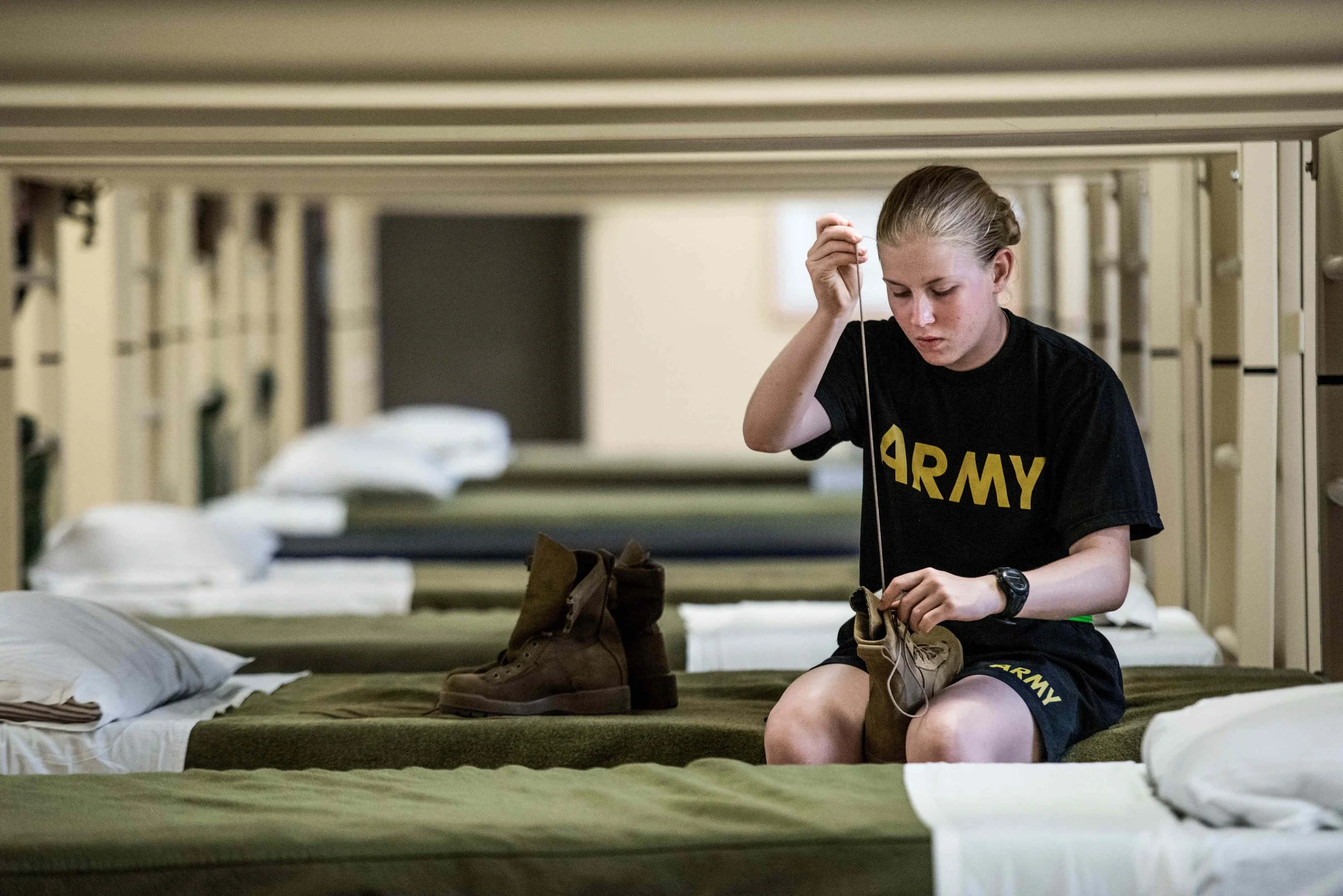
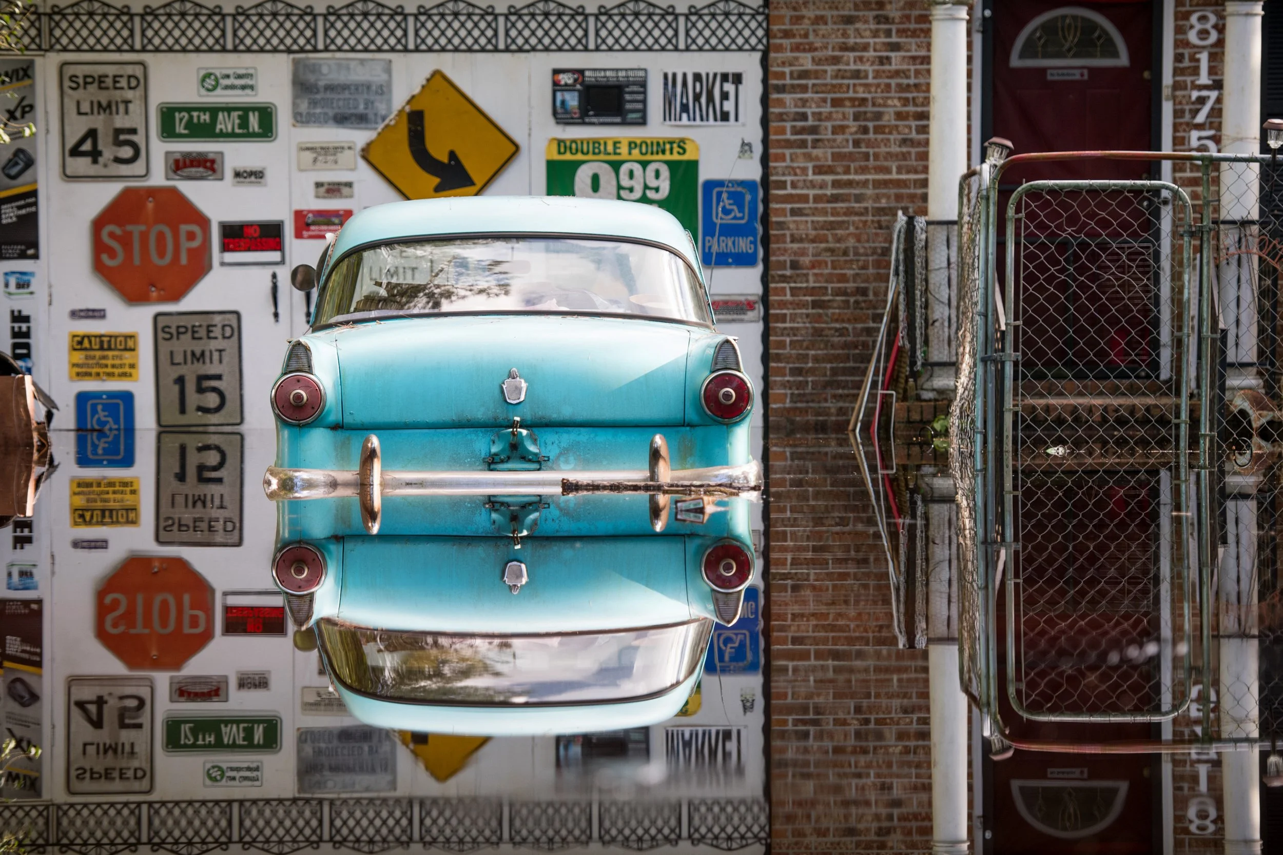
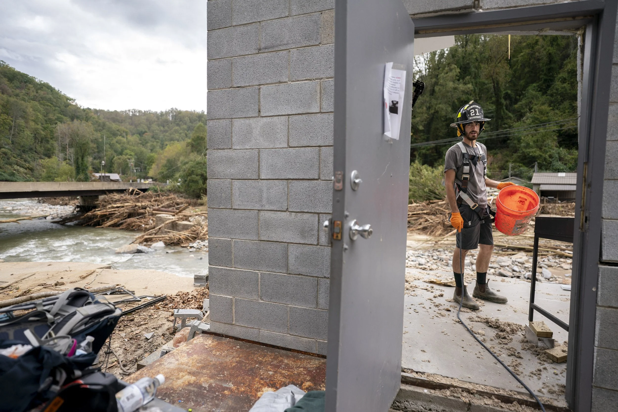
6. Layers for context and depth
When we make photographs, we are transforming a 3D world onto a 2D surface. We can challenge the limitations of this two dimensional world with layers.
The third dimension can be conveyed in a photo when objects overlap, when they fall out of focus and with their relative size. Using depth of field, as adjusted by the aperture, we create more distinguished layers.
When we place objects between our subject and the camera, and in the background, we can add depth.
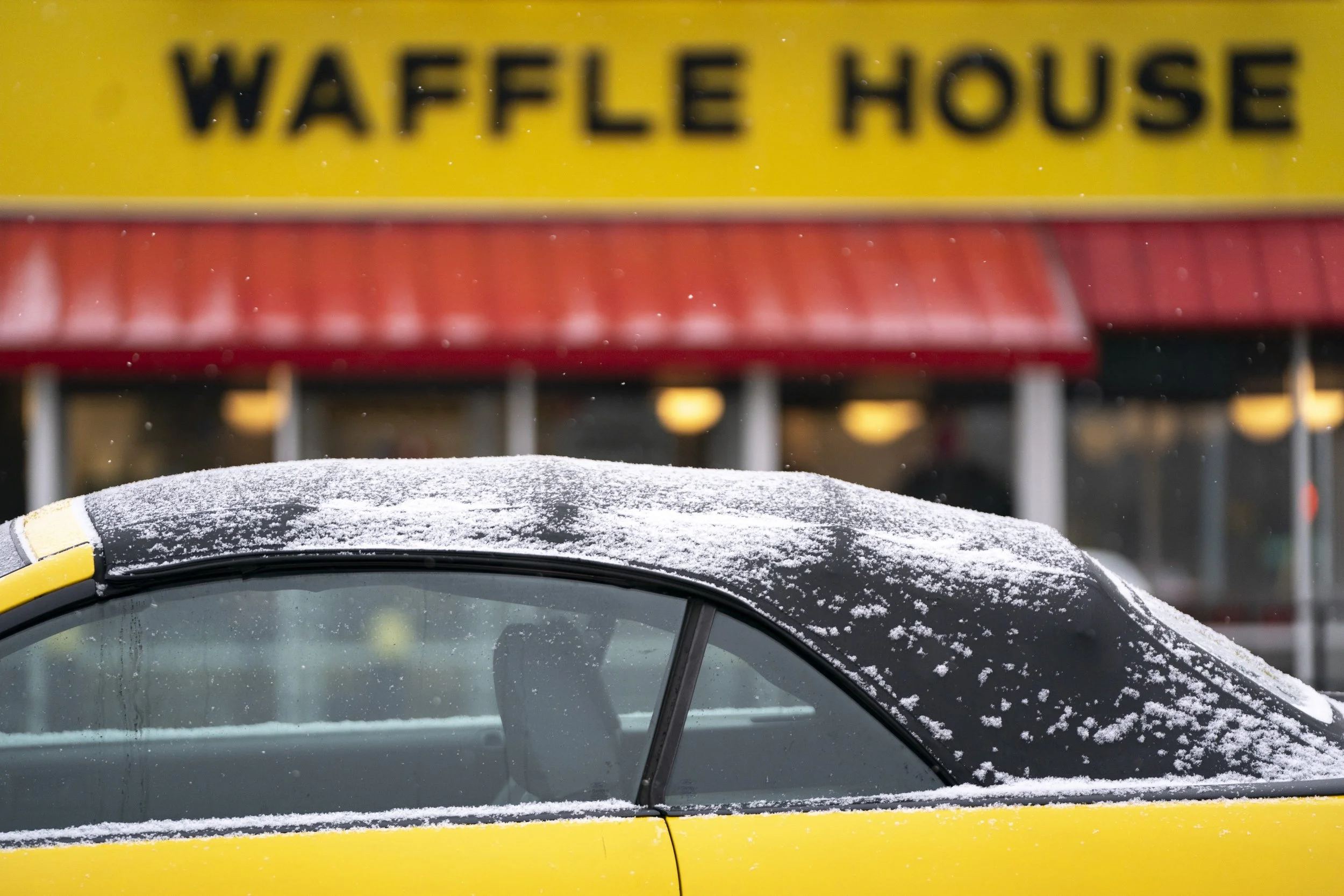
And we can use visual cues in those foregrounds and backgrounds to bring attention to the subject or communicate other things. We can put words in the background. Slightly out of focus but still readable.
Combine foregrounds and backgrounds that work together with a subject’s story.
For example, I used this car dealership sign to communicate the name of the town that was flooding: Fair Bluff, North Carolina.

7. Depth of Field
Photographers control depth of field with aperture and the distance between camera, subject and background. If you stand close to a subject and put the background far away, a shallow depth of field will be exaggerated.
We can use depth of field for visual hierarchy.

8. Visual Hierarchy
Like I mentioned before, I want my photos to take the viewer on a journey. For this, I use visual hierarchy. This gives the viewer cues, as to where their attention should progress while looking at a photograph.
I normally like to bring attention to a main subject first, and then provide a supporting cast for context.


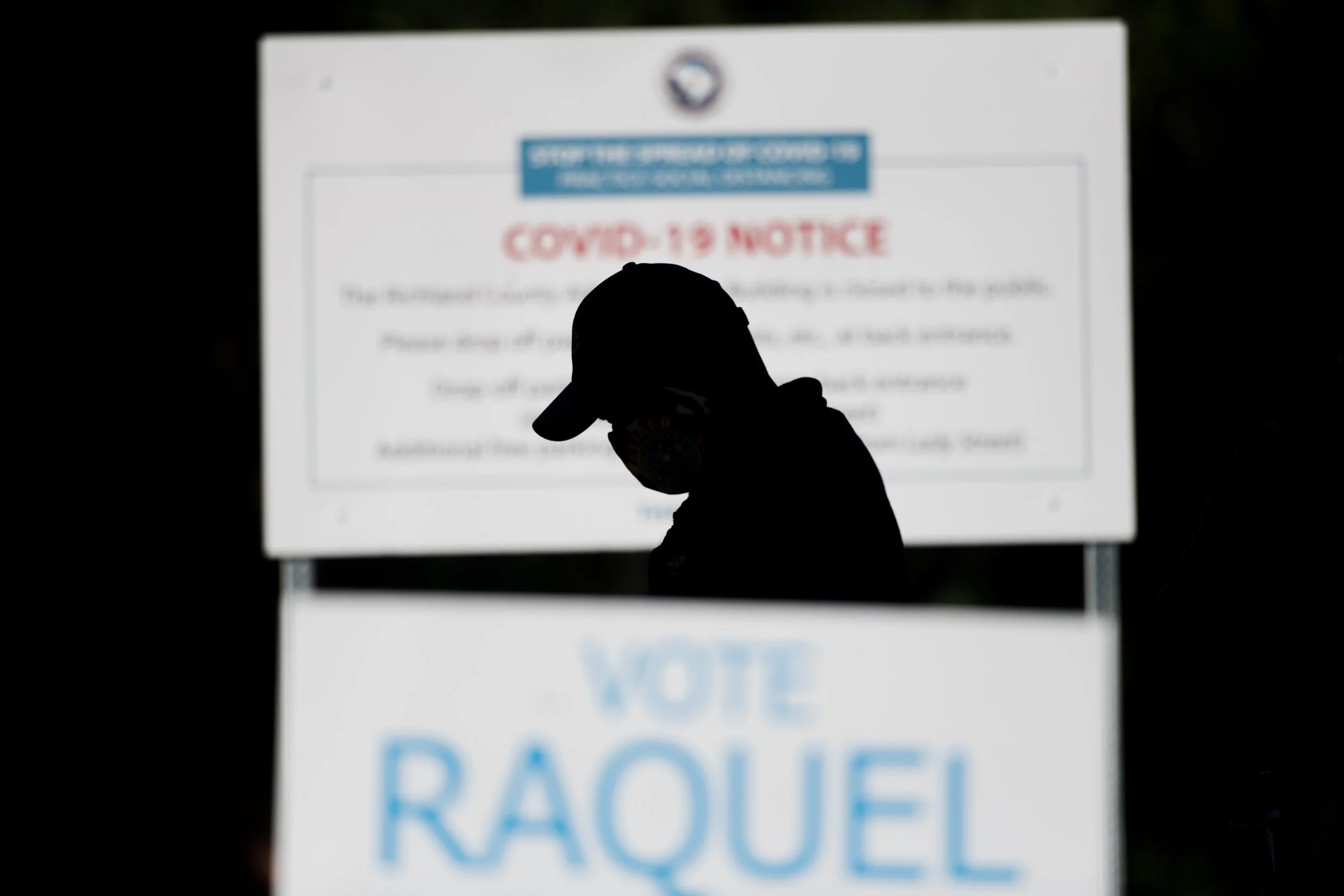
9. Negative space
Negative space is a large area in a composition that is empty. The negative space can be any color or pattern, but it needs to be in contrast with your subject.
Negative space isolates your subjects and makes clear the most important parts of your photograph. Working with negative space will help you master simplicity.

10. Symmetry
Symmetry is when one side of your composition mirrors the other. Use of symmetry can communicate harmonious feelings. It’s highly organized and puts the viewer at ease.
As you explore symmetry you’ll start to appreciate good architects and builders, that can provide uniform backgrounds and elements for your photography.
11. Juxtaposition / Interaction
Big vs. Small. Red vs. Green. Happy vs. Sad
By using different elements that have visual contrast — whether their size, position on the color wheel or emotions — we can make photos more captivating and meaningful.
This can be an aesthetic and a psychological strategy.

12. Use Shadows and light
Light stumped me for the first part of my photography journey. I was trying to apply college-level physics education to light and photography. Bad strategy.
It’s easier than this.
Light has a few properties: direction, intensity, color and quality. Understanding these properties and the interplay between light and shadow will drastically improve your photography.
Shadows and light allow us to isolate subjects and communicate mood. The biggest thing to remember about light is that it is directional.
How is our subject so dark when it was so bright out? Probably because the light is on the other side of the subject than the camera.
If you want to learn about light, find a large action figure or doll. Turn off all the lights in a room and shut doors. Do this at night to avoid sunlight creeping through a window.
Grab one light that you can move around and aim. Keep the camera and figure in the same locations and only move the light.
Bonus Tip: Study legendary painter Edward Hopper.

13. Nested frames
Nested frames, also known as frames within frames, use natural or man-made elements that mimic a picture frame. One common strategy uses doorways and windows.
Why are nested frames effective? They add a layer to your visual storytelling.
14. Color Theory
Color theory concerns the relationship between colors and is about how colors communicate different emotions.
Photographers work with primary colors Red, Green, and Blue. Painters use Red, Yellow and Blue as primary colors. This is because one medium uses subtractive color while the other uses additive color. We’re not going into those details.
Different combinations of these RGB primary colors result in secondary colors like Cyan, Magenta and Yellow.
The simplest way to use color as a photographer—is to use less of it. Limit the number of colors that occupy your composition. And when you use different colors, find colors that oppose each other on the color wheel.
Even though painters use different primary colors, we can still learn from them. They are often the best examples because they have more control over color than photographers do.
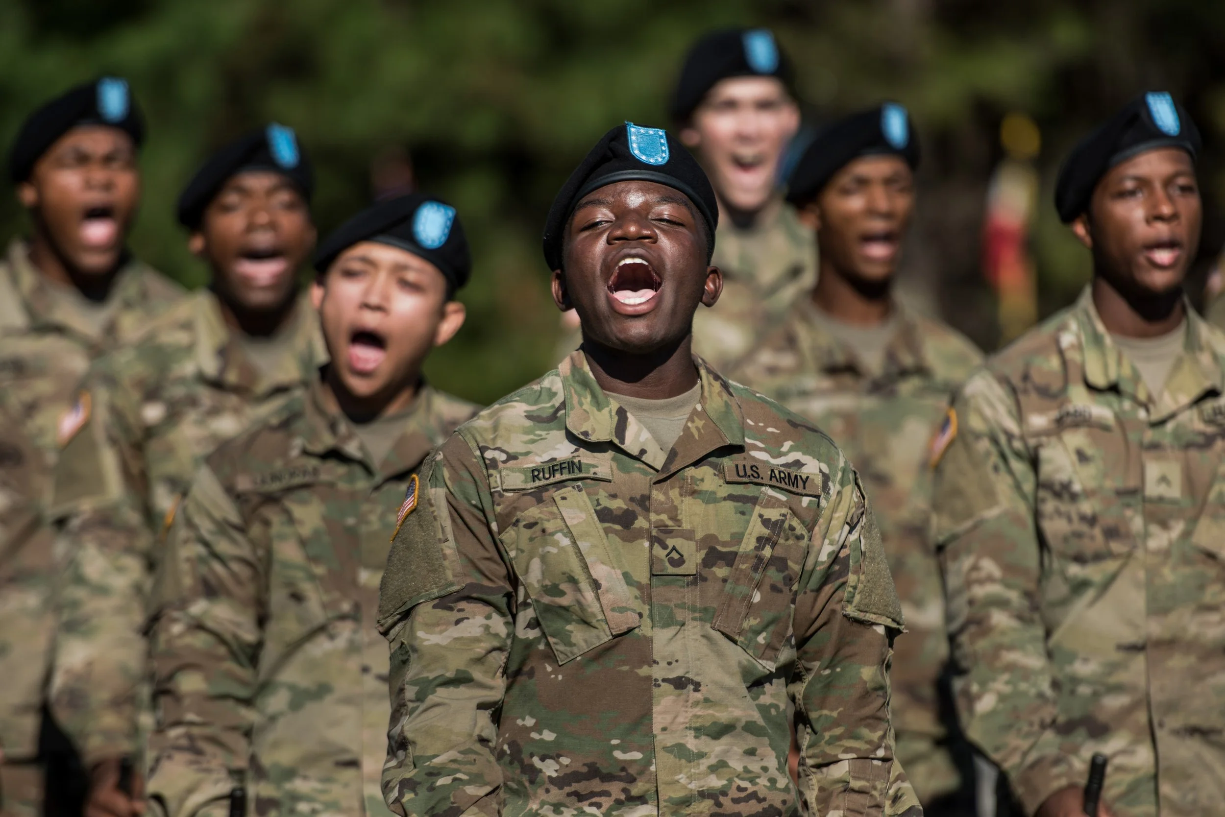
15. Patterns / Repetition
Patterns and repetition create rhythm, consistency, and order. Photographers make this happen with shapes, lines, colors, tones, textures or specific objects. Patterns occur naturally and are man-made.
We can feature patterns as our main element, or use them in a background or foreground. When you come across a pattern that interests you, explore all the angles you can.

16. Scale and Proportion (pvc island)
Scale and proportion relate to size. Scale describes the relationship in size between objects. Proportion represents the relationship in size between parts of an object.
Think about the relationship between tall and short people and the relationships between a person’s torso and their legs.
As photographers, we have control over scale and proportion by using different lenses and by choosing to stand at different distances from our subjects. Objects closer to the camera appear larger in the frame and wide angle lenses distort proportion.

17. Rule of odds
The rule of odds is pretty simple. Look for odd numbers of objects, subjects or forms. A form could be a group of objects or subjects.
Odd numbers prevent our brain from pairing elements of a photograph, guiding us to look for an entry point into the photo.

18. The Decisive moment vs Peak Action
The decisive moment, popularized by Henri Cartier-Bresson, is different than peak action. The decisive moment is more about all the elements coming into place within a frame at the right time for maximum visual harmony.
Peak action is about capturing the most significant moment of a particular action. Like the peak moment when an athlete reaches for a ball or gets tossed in the air. This is independent of the decisive moment, is more about composition.
That said, if we can combine peak action with decisive moments — that’s where the real gold is.


19. Patience
One of the most important aspects about composition and photography is patience.
Patience to stand in the best spot and wait. Patience to let a scene develop in front of you. Patience to observe and predict the future. Patience to get the photo that no one else will.
Patience ties everything together and good things come to those who wait. Slow down and stop trying to photograph everything.

20. Reflexive training
Reflexive training is different than the other tips in this video. But it may be the most important one because it’s about the application of this information.
As a photojournalist or documentary photographer, knowing everything about composition doesn’t matter. It doesn’t matter if you read every book about composition and watch every YouTube video. It doesn’t matter if you went to Ohio University, Western Kentucky or Missouri. It doesn’t matter if you know about Robert Capa, Henri Cartier-Bresson and Mary Ellen Mark. You can’t master composition until it’s reflexive.
And this only happens with lots of practice. To get the hands, eyes and brain working together —you must train the body and mind.
It’s like all the other knowledge in photography — its useless unless you apply it in the moment. This is the real challenge.
As promised, here are easiest and quickest ways to improve composition with photography

1. Background Management
Pay more attention to your backgrounds and the contrast between subjects and other layers. Where does a figure fall in relation to a background? Is there contrast and separation?
2. Change Your Perspective
Move. Move. Move. This is one way to get good at managing backgrounds. See more of them. In addition to changing your perspective on the horizontal plane, get high and low. Don’t make all your photos at eye level.
If you’re photographing a crowd on level ground and want to communicate scale — get high. That might mean reaching up with your camera above your head or climbing a staircase or a parking garage. A drone takes this to the next level.
3. Get Closer and Fill the Frame
Fill the frame by getting closer. This helps eliminate distractions while also harnessing depth of field and layers. Depth of field is dependent on the distance between you and the subject and the other layers of an image.
Robert Capa, founding member of Magnum Photos, is famously quoted, “If your pictures aren’t good enough, you’re not close enough.”
4. Level your horizon
If there’s anything that makes me cringe more, it’s crooked horizons. Feel free to use Dutch angles all you want, but when you aren’t doing that with purpose, level your horizon.
You can level your horizon while making a photo and by cropping it in post. This is a low-effort habit to build and will encourage awareness with the camera and composition.
If you’d like to learn more about photography or looking for a portfolio review I offer personal online sessions. You can find out more info linked in the description.